DESIGN
PISTACCHIO PRODUCTIONS
LOGO DESIGN
2016
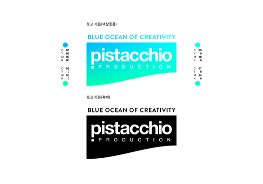
In 2016, three of my friends and I formed Pistacchio Productions, a media art group that worked to design logos and produce videos and photographs in and out of the school. I have designed this group’s logo, and did so in a way that resembles a ‘blue ocean of creativity,’ its main catchphrase. The curvature on the bottom of the logotype symbolises a wave, and a gradient mesh of bright, strong colours communicate the creative energy of the group. I have also merged the shapes of the lowercase letter ‘p’ and the exclamation mark to further emphasise such energy that never drains.
ARTS WEEK
BI DESIGN
2017
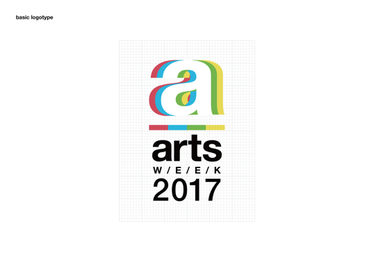
My school’s Arts Week is a major festival in which four branches of art—visual art, music, dance, and drama—come together to produce a wide variety of productions and events. Primarily inspired by coloured lights which make white when mixed, I chose to reflect this characteristic of the festival by creating an image in which four different letter ‘a’s (for arts), each representing one branch of art, come together to create the central white ‘a.’ The employment of many colours, informed by the Korean traditional colour scheme, was particularly appropriate, given that it also conveyed the themes of creativity, diversity, and enjoyment, all values pursued by the Arts Week.
NLCS JEJU SIGNAGE SYSTEM
UI DESIGN
2017
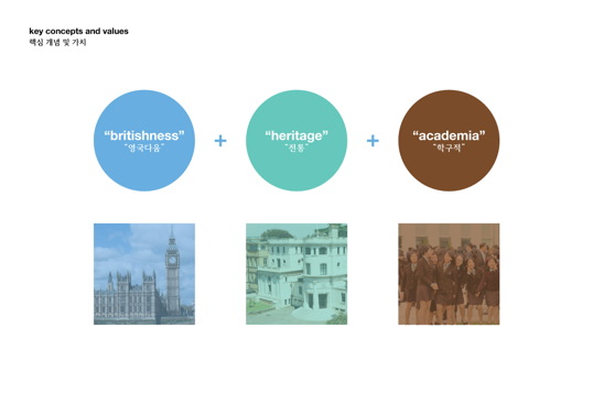
In 2017, my school sought to introduce a system of way-finding signage. Working with the marketing department of the school, I produced an initial proposal for the system. My proposal integrated some of the key symbols of Jeju island (on which my school is located) to the signs that were to be placed around the school, while also emphasising the heritage and the academia of the school. Although the project itself was halted before completion, and my proposal hence did not result in fruition, this was a good opportunity for me to examine and explore how to effectively deliver information through design.
THE ISLANDER
BI DESIGN
2015
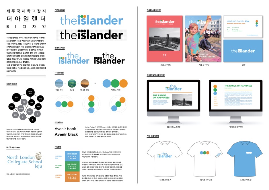
The Islander is a student-led magazine of my school, for which I work as an editor and the Head of Design and Photography. In 2015, as my first design project, I have devised a new brand identity for the magazine, the centrepiece of which was the three circles representing the nature of Jeju, the island on which the school stands. While the school’s official sky blue colour was used to emphasise the magazine’s link with the school, I have used a sans serif typeface to avoid the identity looking overly static or boring.
FOBISIA CHORAL FESTIVAL
LOGO DESIGN, 2016
JEJU OLLE TRAIL
BADGE DESIGN, 2018
ISO PHOTOGRAPHY CLUB
LOGO DESIGN, 2016
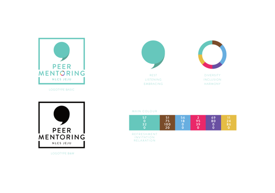
The school’s peer mentoring programme, which I am a part of, was in need of a new brand identity in time with its reboot. I have proposed a design language with two symbols: one that can be interpreted as either a comma (signifying rest) or a speech mark (representing listening and embracing) and the other dubbed ‘the circle of inclusion.’ A wide range of bright colours were used in the identity in order to convey the feelings of joy, happiness, and relaxation—the key concepts the programme leaders wished to link with the programme.
